dry point
|
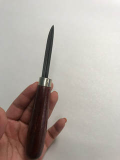
Title: Unnecessary
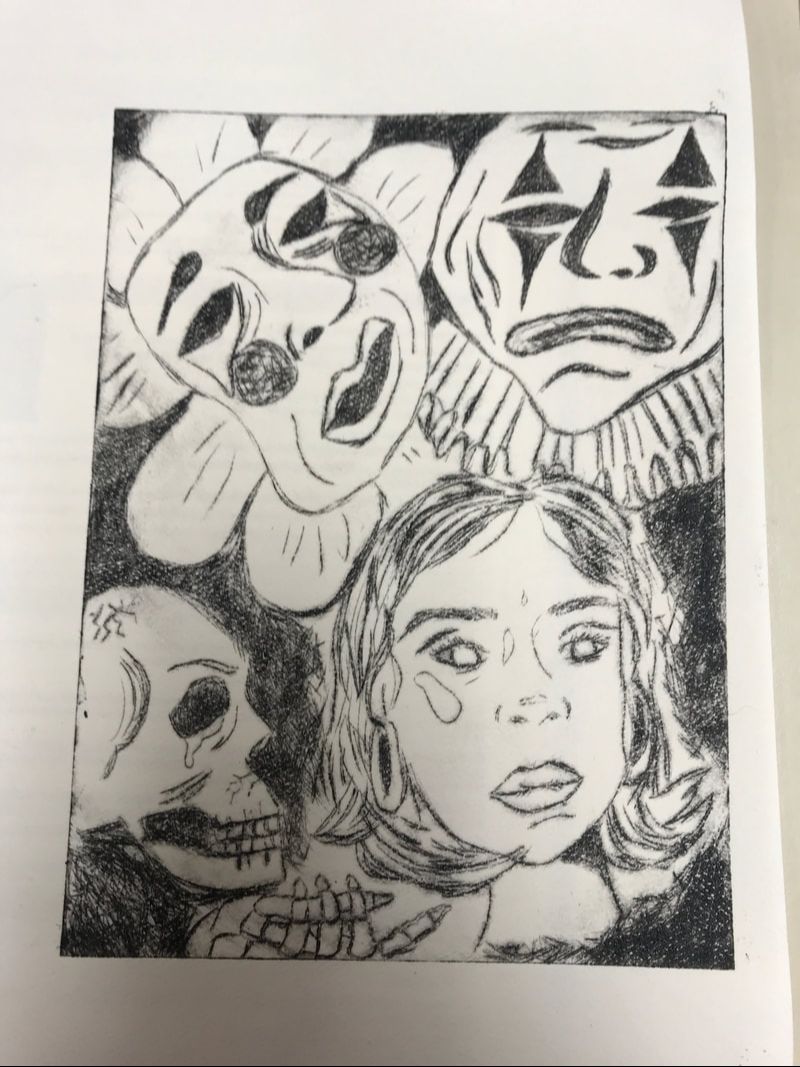
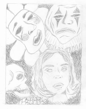
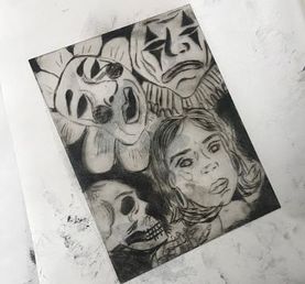
Size: 17.5cm x 12.5cm Medium: Dry Point Completion: November 2018 When I first made this drawing I wanted to illustrate how I'm my own bad influence in me and how overthinking always distracted me where I don’t understand who I am at certain points. I get the sense of being lost and when people start pressuring me that’s when I don’t understand anything. I want to do well and want to be fine but life gets confusing when there’s so many bad things going on you don’t know how to pinpoint who will help you out. This is mainly just to demonstrate what it feels like to feel bombarded by pressure.
|
inspiration
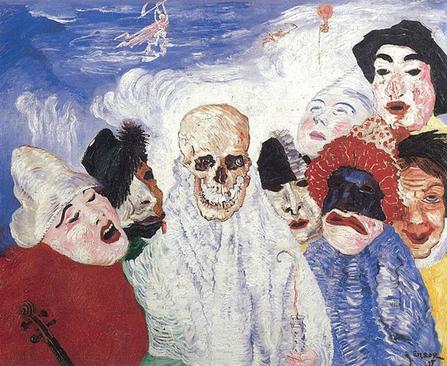
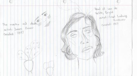
"Death and the Masks"by James Ensor(1897) Oil on canvass.
www.moma.org/collection/works/79855. |
My inspiration was eval Belgium expressionism and surrealism artist who were associated or was part of the group LXX. Growing up he didn’t have much interest in academic study and therefore he turned to the arts, built his own studio in his parents attic. He had a wide series of paintings that were related to masks and death and if you’re all be related due to the masks that his family made in his shop which really represented a lot of color integration of gestures and exquisite turbulence. This is where he began to relate this to death of these mass began to challenge death. In his work the masks he uses very vibrant colors and many textures to create a flow of movement between his painting. What I wanted to take out from this artist was his strange shapes of the mask and the many brush strokes to replicate it with my scratching tool on my plate.
|
|
Ernst Ludwig Kirchner was as well known artist he was part of a our group called, "The bridge" that mostly focus on expressionist artists. He was inspired by the graphic art of German to Gothic artist creation for him was a very directly inspired his work through the long run he has a wide range of paintings. Some were with vivid colors and being geometric. Showing textures in, "Head of Van de Welde, Bright" is in black-and-white and strangely distortion. Keeping mine black-and-white instead of water color painting it. Using histechnique, "Head of Van de Welde, Bright" the dense lines and crosshathing used in his piece to add shade and form.
|
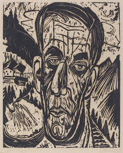
Head of Van de Welde, Bright" by Ernst Ludwig Kirchner (1917) Wood cut out.
www.britannica.com/biography/Ernst-Ludwig-Kirchner. |
planning
When I began to plan this out I had no idea what I wanted to do I began to look at many artists and see which ones I liked. When I found two that I liked I wrote them down on my notebook I didn’t have my sketchbook at a time but I know I really liked the artists and pieces they made I immediately began jotting down ideas. I went I got to my sketchbook I drew it out and immediately liked it then I begin to scratch-hatch, it to give it dimension, texture and shading. When I began brainstorming ideas every’s I wanted to have the masks and heads to be flowing out of my head but I decided not to because it wouldn’t relate to the pressure people put on me and decided to add a skeleton to represent me myself the inside of me putting pressure on myself.
|
|
printing process
|
|
When I began first I had to tape my thin piece of plate on to my drawing , this would prevent it from moving while i was scratching it with the etching tool. I went in the scratch-hatching motion outlining my main my big details and then later on going in again and creating shade. When I began the face I had to be really soft lines and then my main my big details and then later on going in again and creating layers and shading.
|
|
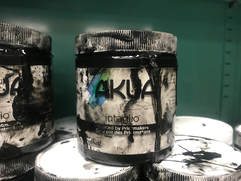
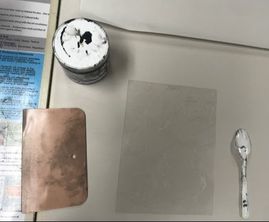
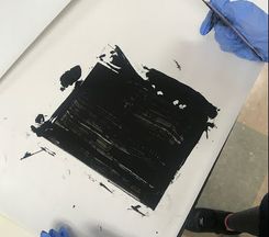
Once I had finished etching in my drawing I got gloves, grab the oil base paint and at first I began by putting paint at the top of my plate then with a squeegee I pressured it in and spread it across it completely covering my plate. After that I had to grab papers and wipe off the top that wasn’t in the crevices this took me a while because the paint was really dense and oily.
|
|
|
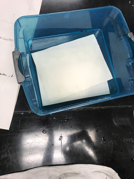
Once once the paint was removed I could it out 8 x 11 1/2“ of watercolor paper and submerge them in water for eight minutes once they were done I patted dry with a T-shirt. When I finish drying them I went and took them to the roller I was going to roll out my print I placed them the right way and made sure there is clean paper. When I had to roll it out I did it continuously in order to prevent lines from stopping the roller once I finished I looked at my results and placed it on the drying rack.
experimenting
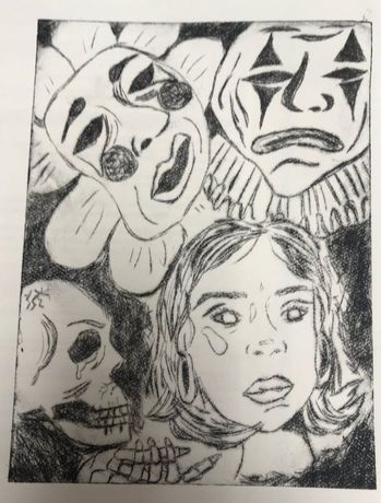
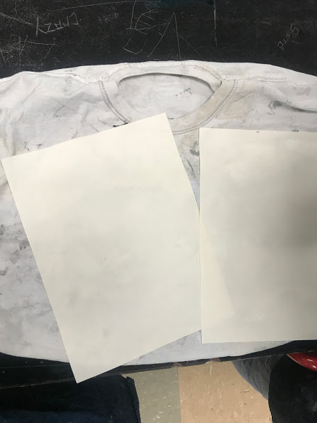
In my first print I noticed that in the bottom there wasn’t a lot of ink and the hand of the skeleton and my face features weren’t that clear they were really fading away. Therefore I had to make another one and in my second one I have the same issue and I realized the was issue was I was only placing ink on the top part and then spreading it down and I had help from a fellow classmate that told me to, place it a little bit all around my print and make sure to completely press in the ink and not to wipe off too much. That’s when my last print came out looking really nice and clear.
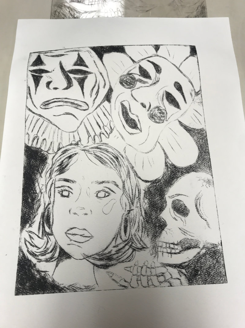
1st print
|
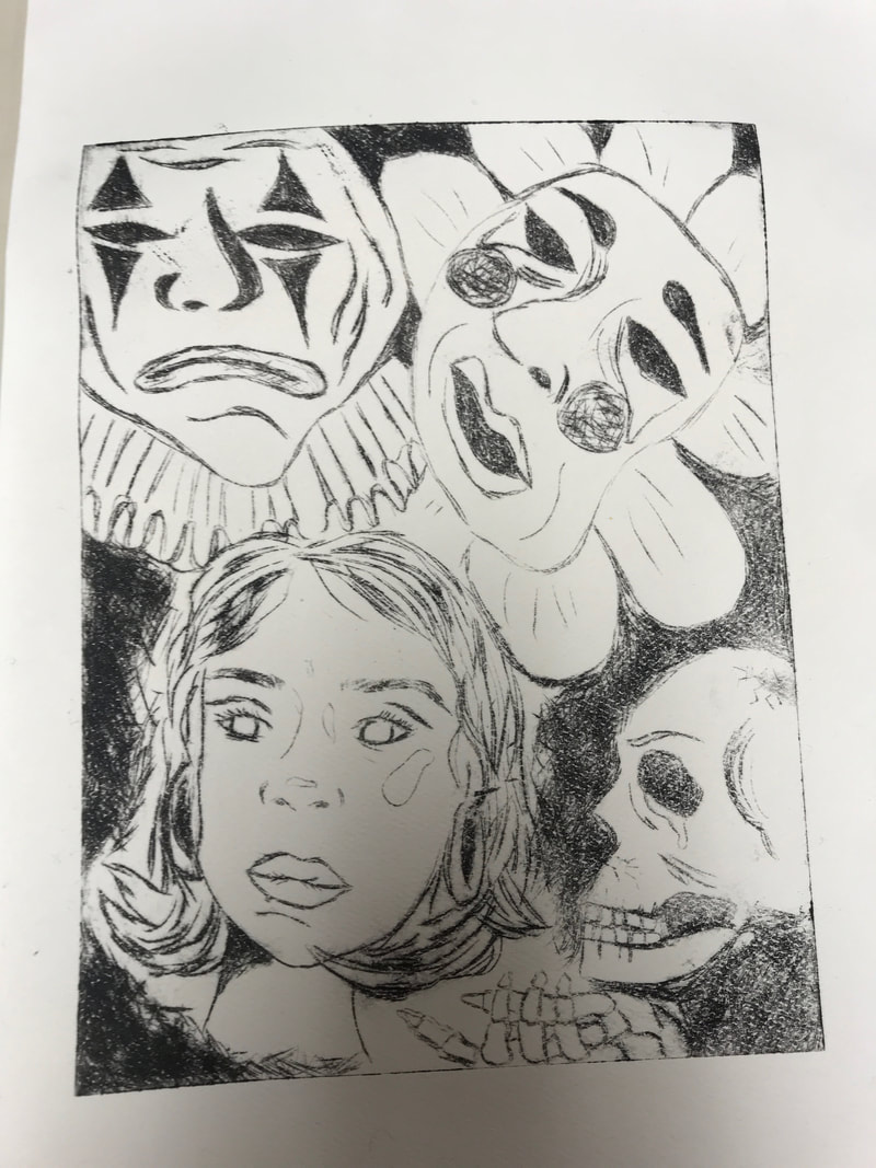
2nd print
|
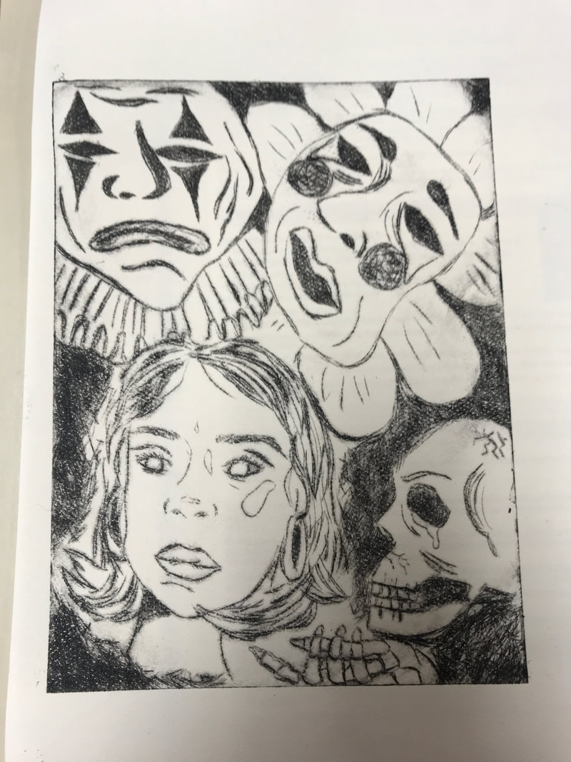
3rd print
|